What Is a Gantt Chart? Explained Without the Jargon
What Is a Gantt Chart, Exactly?
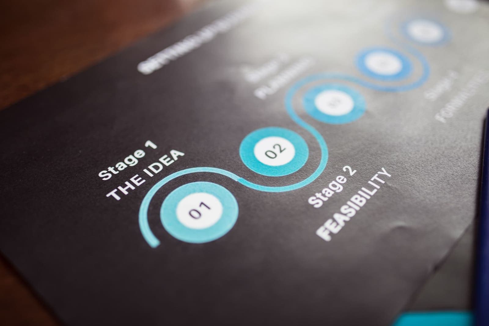
You've probably seen one and had no idea what it was called. Tasks listed down the left side. Days or weeks stretching across the top. Colored bars filling in the grid to show when each task starts and ends.
That's a Gantt chart. The name comes from Henry Gantt, an engineer who popularized the format in the early 1900s for scheduling factory work. The core idea hasn't changed: you're looking at what needs to happen and when it needs to happen, at the same time, on a single grid.
Most people encounter Gantt charts in a corporate project management context and walk away thinking they're complicated, bureaucratic tools built for teams with dedicated project managers. That's a fair reaction. A lot of Gantt software is just overkill. But the underlying format is just a calendar with rows, and that simplicity is exactly what makes it useful.
Stripped down: tasks on the Y-axis, time on the X-axis, bars or markers showing duration. That's the whole idea.
The reason what is a gantt chart keeps getting Googled isn't because the tool is obscure. It's because most explanations bury the simple part under project management vocabulary. This one won't do that.
How a Gantt Chart Actually Works
Take a simple example. Say you're preparing for a job interview coming up in two weeks. You have several tasks: update your resume, research the company, prep answers, do a practice run, pick an outfit.
On a to-do list, those tasks just pile up with no sense of when each needs to happen. In your head, they all feel equally urgent.
On a Gantt chart, you place each task as a row. Then across the top, you have days (say, the next 14 days). You fill in which day you plan to work on each task. Resume goes in days 1-2. Company research goes in days 3-4. Prep answers gets days 5-9. Practice run on day 10. Outfit on day 12.
Now you can see the whole thing at a glance. Nothing overlaps impossibly. You know what each day is for before it arrives.
The difference between a bar and a checkbox
Classic Gantt charts use horizontal bars to show duration. A task that spans three days gets a bar three columns wide. Some lighter versions, especially for personal use, skip the bar and just mark which days you're working on something, or even break a task into discrete steps you can check off as you go.
Weekloom takes the second approach. Each task is a row, each column is a day, and within a task you can add steps: small checkable items that make up that task's work. So instead of a vague bar labeled "write essay: days 4-7," you'd have the task Write essay with steps like outline, first draft, revise intro, each mapped to specific days. It's the Gantt chart basics applied to individual planning rather than team project management.
If you're curious what that looks like in practice, the no-signup demo shows it running in the browser with no account needed.
Gantt Chart vs. To-Do List: The Real Difference
A to-do list answers the question: what do I need to do?
A Gantt chart answers: what do I need to do, and when am I actually doing it?
That second question sounds minor until you've had a week where everything was on the list and nothing was in the calendar and Thursday arrived with six things still undone. The list didn't lie to you. It just had no opinion about time.
Gantt charts force you to confront capacity. When you try to plot five tasks across three days and the grid fills up by day two, you learn something a to-do list can't tell you: the plan is physically impossible. You have to choose what to move or drop, before the week defeats you.
This is why Gantt charts work well for projects with deadlines, not just ongoing habits. If you have a fixed end date, a Gantt grid lets you work backward and see whether the time adds up. A to-do list has no way to show you that. It also can't show you what's missing: if you delete a task from a list, the list just gets shorter. If you remove a task from a Gantt chart, you see a gap in the schedule, which might mean the project now lands a day earlier, or that you have space to add something you forgot.
For more on why plain lists tend to fail under real week conditions, the piece on why your to-do list keeps failing you is worth reading alongside this one.
When a Gantt Chart Is Overkill (and When It Isn't)
The honest answer: most professional Gantt software is way more than most people need.
Tools like Microsoft Project or even modern platforms like Asana or Monday.com are built for teams coordinating across dependencies, resource allocation, and client-facing timelines. If you're a solo person trying to plan a personal project or organize your week, you don't need critical path analysis. You need rows and columns.
Gantt basics are useful any time you have:
- More than a handful of tasks
- A defined time period with a fixed end
- Tasks that can't all happen simultaneously
- Any need to see the week as a whole before it starts
Students planning exam prep, freelancers managing client projects, solo founders shipping features, anyone trying to plan a move or renovation: these are all cases where a simple Gantt grid gives you clarity a list can't.
People who don't need one: someone managing a single recurring daily habit, or someone whose work is mostly reactive and schedule-driven by others. A Gantt won't help you if you have no control over what you work on.
The research on visual planning supports this. A 2019 study in the Journal of Experimental Psychology found that mapping tasks spatially, rather than listing them, reduced planning errors and improved time estimation accuracy. People who could see their plan made more realistic commitments.
Using a Gantt Chart for Personal Planning
Most Gantt chart content online assumes you're a project manager in a company. The examples involve software sprints, construction milestones, marketing campaigns. If you're none of those things, the format can feel like it doesn't apply.
It does. The structure translates cleanly to individual planning.
Say you're planning a job search alongside a full-time job. You could have rows for: update LinkedIn, apply to 3 companies this week, reach out to contacts, prep for interview Monday. Across the top: Mon-Fri. You drop each task into the days it belongs, and you add a couple of steps inside the bigger ones (for the interview prep row: research company, write STAR answers, practice aloud).
Now you have a week that's visually accounted for. You're not guessing. You're not lying to yourself about how much fits.
This is the direction personal Gantt charts have been going: lighter, faster, aimed at individuals rather than organizations. Weekloom was built specifically around that: a grid you can fill in Sunday night in five minutes and actually use all week, without needing a tutorial.
The format also pairs naturally with weekly planning routines. If you sit down every Sunday (or Monday morning) and map the week on a Gantt grid, you build a habit of seeing the week as a fixed container with real limits. That shift alone changes what you commit to. For a fuller take on building that habit, the weekly planning guide goes deeper.
One thing worth knowing: you don't have to fill every cell. The grid isn't meant to be maximized. Leave gaps for the things that always come up. A Gantt chart that looks 80% full is usually more honest than one planned to 100%.
A common mistake with Gantt charts
People new to the format tend to treat it as a wish list. They assign every task to every day with no slack, and by Wednesday the plan has collapsed. The issue isn't the tool. It's the assumption that planning means fitting everything in.
A better way to use a Gantt grid: put your hard commitments in first (the things that have to happen on specific days), then layer in the flexible tasks around them. If a task can move, mark it in pencil. You're not building a wall. You're building a scaffold.
If you want to see how a Gantt-style week actually looks on paper before committing to any tool, just draw a 7-column table on a blank page. List five or six things you need to do this week down the left. Put Monday through Sunday across the top. Fill in which day each task is actually getting done. That five-minute sketch is a Gantt chart. Everything else is just implementation.
Start there, then decide whether you want software around it. The format is older than computers, and it works fine on paper.